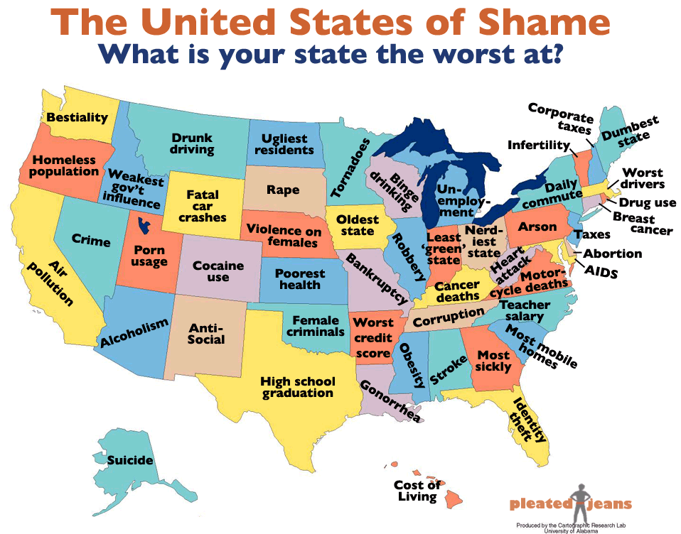
I saw this map while scrolling through The Daily Dish, and although I find it interesting (due to many reasons, the greatest of which is that of what data sets were used), I wanted to point out the ambiguity of the title: "What is your state the worst at?"
This type of phrasing is what gets people into trouble, especially non-English speakers. To show you what I mean, take the example of Michigan. Apparently, Michigan is "the worst at" unemployment. So... does this mean that the ability of Michigan to successfully accomplish unemployment is low (i.e., that unemployment is low; that employment is high)? No. The same thing for almost everything, save for aspects that are not inherently negative.
This points to the implicit understanding of a negative statement (or question) and the correct (culturally dependent) response to that statement (or question). We understand that Michigan has very high levels of unemployment (one of the worst in the country), which, strictly speaking, makes Michigan the worst at employment (although Nevada presently has the highest unemployment levels). Similarly, we understand that Arkansans have (on average) the worst credit scores in the country, which, strictly speaking, makes Arkansas the worst at credit management.
Conversely, when looking at concepts that are not inherently perceived as negative (e.g., teacher salary or high school graduation), the cognitive dissonance is much lower. The literal and implied meanings behind the label showing Texas being the worst at high school graduation seem pretty coherent, as does the label showing North Carolina being the worst at teacher salaries (although, to be pedantic, it would be more accurate to say that they are the worst at the monetary compensation of teachers).
Then there is "tornadoes"... How can a state be "the worst at" tornadoes? The phrasing of "is the worst at" implies something influenced by society. Tornadoes aren't (AFAIK) a social phenomenon. However, tornado damage is. But how does the viewer know what characteristic of tornadoes is being cited as "the worst"?
In the end, the map is humorous and informative... if (respectively) the viewer understands something about the states and understands the logic behind (what is effectively) a double-negative.
Map originally from here.
UPDATE: A counter-map was made over at Political Language.
At least this map doesn't suffer the problems of language as the one above. However, I have one general question: How can Arizona do "sunniest" well? I mean, I suppose they could have the most social groups (government and private) that enhance the culture of sunniness. However, I think that the label is based on data on the number of sunny days, and not the number of sun societies.


No comments:
Post a Comment