 My initial comment of the graph was:
I look at graphs like this and wonder, “Where are the error bars?” (or range of errors)To this, one commenter seemed to wonder why I (and others) have recently been so critical of graphs, and (erroneously) stated that error bars weren't relevant. To which I answered:
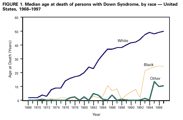
If the increase in the number of blacks increased because of a relatively few really high-survival cases, this would be seen in the error bars. Similarly, if there is a lot of overlap between Blacks and Other, then it would imply that separating out the two might not be very useful in terms of a comparison.
Similarly, showing all the numbers on a linear-linear scale makes it difficult to see if no black children lived past one year-of-age in certain years, or if it is just a really small number. Using a linear-log scale would really help out here.
Basically, my gripe is that the graph — without error bars — doesn’t give a lot of information for comparative purposes, especially between “Blacks” and “Others”.
Another commenter was wondering what changes occurred during the 13 years after the graph data, and (as a procrastination measure) I looked around a little bit. In a paper (which requires a subscription), I found the following graph:The error bars you cite the lack of was not relevant in the study being done and thus were not included.And yet (and yet), you cite the 95% confidence interval… from which one could draw error bars. Apparently, the it was felt that the 95% CI was important enough to report, so perhaps they just didn’t know how to put it on the graph. (And considering the other problems they had with their visual representation, cited by me and others, it could just be that the authors didn’t know how best to do this, or their graphing software couldn’t do it very well.)
And why shouldn’t one be critical of the image being presented, especially since it presents (incorrectly, or — more graciously — obfuscatorily) data about a social effect? True, the point of the post is not the graph, but as others have pointed out, there is the problem of what a 0 means here. Is it “no data” or is it actually that no babies survived? Also, the error bars (or range of error) — which you erroneously state as not being relevant to the study — would really help interpret how the values between racial groups relate to each other.
But I turn the question over to you, Patrick: Why don’t you like it when people are so critical of presented graphs, especially when they point out obvious deficiencies of said image (on a blog about the sociological meaning and — I would argue — interpretation of images) that could alter how people interpret the meaning behind said image? (Especially since many of the recent posts are about graphs.)

Figure Reference:
Mikyong Shin, Lilah M. Besser, James E. Kucik, Chengxing Lu, Csaba Siffel, Adolfo Correa the Congenital Anomaly Multistate Prevalence and Survival (CAMPS) Collaborative "Prevalence of Down Syndrome Among Children and Adolescents in 10 Regions of the United States" Pediatrics, Dec 2009; 124: 1565 - 1571.
No comments:
Post a Comment